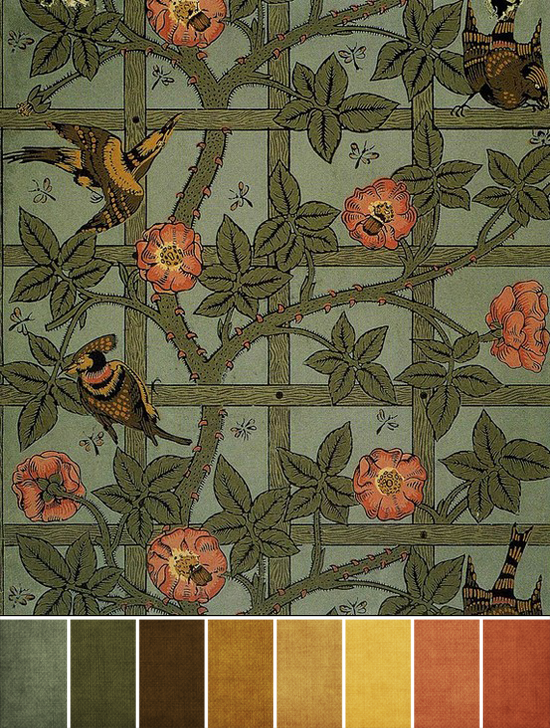
This is going to sound nuts, since it's winter here in North America, but when I first saw this month's Challenge photo, it struck me as a perfect photo for January. Because it's right around this time, after the holidays have ended, the new year has arrived, and life has started calming down, that I start craving spring. And this William Morris design is a nice taste of what's to come, don't you think?
When it comes to winter colors, I think of subtle, quiet tones, which this Challenge photo definitely has. Soft grayish greens, muted yellows, and quiet peaches, all subtle enough to fit into the season while still hinting at spring. I especially love the pops of reddish-orange against the cool gray-green of the background.
Even the natural subject matter is perfect, with flowers growing, insects buzzing, and birds resting on a trellis in a garden. It's getting me excited for warmer weather, which I'm always a fan of. How about you?
Beyond that, though, I think it's a great choice for this month's challenge because there's a lot of directions you can go in regards to theme. Flowers, leafy nature, flying birds, insects, vines, wood textures, grids and patterns, an Arts and Crafts style, or even just a mix of subtle colors.
What do you think? Which direction do you like best? What colors do you see?
For more about Brandi, you can visit and connect with her on her blog, Brandi Girl.


2 comments:
After seeing this months challenge I had searched for color combos on Design Seeds and came up with a color scheme very similar, although it didn't have the browns in it or the yellow. I like your scheme very well, too. And I see the leaves, wood textures and vines.
Interesting article. Indeed an article worth reading for. The contents are indeed informative. Great choice of topic and the content are brief and concrete.
Post a Comment