Tuesday, March 5, 2013

March Monthly Challenge Sponsors + Prizes


Our wonderful sponsors for the March Monthly Challenge. 
We will have 2 lucky winners this month.

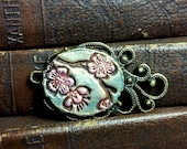
D'Arsie Manzella of Mamacita Beadworks makes wonderful pewter beads and buttons.
All of D'Arsie's beads, pendants and buttons are sculpted and cast by hand in fine quality lead free pewter. They are a great addition to your creatitons!
D'Arsie is donating a $50 gift certificate to her Etsy Shop.

 Visit D'Arsie on her website, Etsy and Facebook.

: : :
Indian Creek Art Glass

Julie Brugard of Indian Creek Art Glass makes beautiful lampworked beads. Julie has been making these miniature works of art for 5 years in her home studio not far from beautiful Lake Tahoe. Beautiful color combinations and textures to enhance your designs.

Julie is donating a $50 gift certificate to her Etsy Shop.

Visit Julie on Etsy, Blog and Facebook.
: : :
Submit photos of your wonderful creations using one or more Art Beads.
Deer in the Forest by Marc Franz has with many different elements that can be used for inspiration: trees, deer, movement, block color, red, yellow, blue, green and cubism.
We can't wait to see where your creativity takes you with the art for this months challenge! 
Please remember to put MAR ABS in the title or tag of your submission(s).  
Provide us with the artist of the Art Beads used and we always love to know all the materials you used. 
***Art Beads MUST be used in your entry.***

Monday, March 4, 2013

March Monthly Challenge


Deer In the Forest, 1911
Marc Franz
Oil on Canvas, 100.97 x 104.78 cm
Philips Collection, Washington DC, USA
(Please note this art is copyrighted and is to be used only as inspiration.)

About the Art
"Amidst and integrated with the form of the deer is a panoply of force lines and transparent planes; an underlying organization of these exists in the pattern of parallel diagonals moving downward from the right and left edge, meeting in the middle. A secondary pattern exists in the rectilinear planes of color on the left opposing circular patterns on the right. while a blue mountain is absent, a smaller triangle encloses two of the deer; it and the blue tree at the left edge provide an uplifting quality. Contrasting the blue is the intense red throughout the center of the picture, oranges at top and bottom, and the feathery black in the upper right.
The all-over organization of the canvas uniting animal to landscape, diminishes the heroism of the animal subject as depicted by Marc in 1911. Supporting Marc's latest conception of the world was Wilhelm Ostwald's theory of energy, in which matter is considered illusory. Only energy lines reveal appearance such as it is. In Deer in the Forest, this conception results in an energized atmosphere of randomness and chaos. the sense of an inchoate environment demonstrates both Marc's feeling of the world as a whole and his developing urge to represent Creation, and aspiration that is present in the works of Wassily Kandinsky and Paul Klee."


About the Artist

Franz Marc (February 8, 1880 – March 4, 1916) was a German painter and printmaker, one of the key figures of the German Expressionist movement. He was a founding member of Der Blaue Reiter (The Blue Rider), a journal whose name later became synonymous with the circle of artists collaborating in the journal.
Franz Marc contributed to the vision of abstraction in its second wave, 1911-14, by wedding an Expressionistic outlook to the new pictorial developments emanating from France. There, formal innovations were largely an end in themselves. But in the hands of Franc Marc and Wassily Kandinsky, arbitrary color, faceted planes, and pictorial structure became modes with which certain deeply held themes could be stated. Marc's achievement was in effect creating works of art that, through abstract means, evinced his conception of the overall unity and character of nature. 
As a founder of the Blue Rider, Marc holds a place in the theoretical impact of this pivotal movement of future developments, such as Dada, and Bauhaus. More specifically, Marc was to have an influence on his colleague Paul Klee. the latter described their relationship as a pair of overlapping circles, with a "relatively large common area." Although a year younger, Marc reached artistic maturity ahead of Klee. In general, the overall delicacy of touch and transparency in Marc's watercolors are close to the work of Klee after 1914. Also, certain motifs appear fist in Marc's work and subsequently in Klee's; for example, Marc's use of triangles and upward-moving forms to imply aspiration became a constant in Klee's art. The two shared much in common theoretically, especially the desire to see through a transcendent vantage point. reinforcing their common belief in fate was the fact that, on the day Klee received word from Maria Marc of his friend's death, he was drafted. 
The desire by the German wave of abstractionists to unite the new pictorial means from France with ambitious or transcendent subject matter, or both, quickly became the goal of subsequent movements of twentieth-century abstraction. While Marc was not alone in possessing lofty aspirations, he and Wassily Kandinsky established a critically important step in making Cubist and Fauvist harmonies apply to an elevated concept of subject matter. For instance, the desire for the content of epic proportions became a touchstone in the work of Kasimir Malevich and Piet Mondrian, and then, among American Abstract-Expressionists Jackson Pollock, and Mark Rothko.


Blog Tour
The Blog Tour deadline is March 27th.
Links must be added to the Art Bead Scene flickr page where you upload your entry. 
The Blog Tour will be on March 29th.

Monthly Challenge Winners
Winners will be randomly chosen from all the qualifying entries on March 1st.

Our Sponsors
Our Sponsors this month are Mamacita Beadworks and Indian Creek Art Glass.
Please visit us tomorrow to see the prizes!

Featured Designer of the Week:
From all the entries during the month, an editor is going to pick their favorite design to be featured every Monday here on ABS. We want to give our participants more time in the spotlight! Our Featured Designer will be this Monday, so get those entries in soon.

How to enter the Monthly Challenge:
1. Create something using an art bead that fits within our monthly theme. We post the art to be used as your inspiration to create. This challenge is open to jewelry-makers, fiber artists, collage artist, etc. The art bead can be created by you or someone else. The challenge is to inspire those who use art beads and to see all the different ways art beads can be incorporated into your handiwork. 
An Art Bead must be used in your piece to qualify for the monthly challenge.
***Beads strung on a chain, by themselves and beads simply wire or cord will not be accepted.***

2. Upload your photo to our flickr group. Detailed instructions can be found here and click here for a tutorial for sending your picture to the group.
Please add the tag or title March ABS to your photos. Include a short description, who created the art beads and a link to your blog, if you have one.
Deadline is January 31st. Photos are approved by our moderators, if a photo hasn't followed the guidelines it will not be approved. You may upload 2 photos a day.

What is an Art Bead?
An art bead is a bead, charm, button or finding made by an independent artist. Art beads are the vision and handiwork of an individual artist. You can read more about art beads here.

***A bead that is handmade is not necessarily an art bead. Hill Tribe Silver, Kazuri ceramic beads or lampwork beads made in factories are examples of handmade beads that are not considered art beads.
Beaded beads, stamped metal pendants or wire-wrapped components are not considered art beads for our challenge.***

p.s. If you have a blog, post your entry and a link to the ABS challenge to spread the beady goodness.

Sunday, March 3, 2013

Show Me Sunday - Flower Beads with Rebecca of Songbead

Happy Sunday, Art Bead Sceners! Here in the UK, it really is beginning to feel that Spring may be here, or at least just around the corner. The sun is out, and after a really busy week for me - a whole load of new beads in Curious, new jewellery designs for Songbead. Today, I am hoping to get out and about in the sunshine and enjoy it whilst it lasts.

This month we are looking for and asking you to share you handmade flower beads - very apt for the season. Last week, Elise Thomas shared some of her beautiful new lampwork flower bouquets - perfect just as they are, as well as for creating with.


I love these gorgeous colours together!

I came up with a treasury to get you started. Don't forget to share your favourite flower finds here in the comments too.

'Handmade Flower Beads' by thecuriousbeadshop


sakura flourish - cherry bl...
$16

Oxidised Copper Poppy Bangle...
$9.5

Flower Bead Caps- handmade c...
$14

Bronze Copper Flower Connect...
$16

Brown Stoneware Hibiscus Pen...
$10

Tri Flower Trumpet- Ocean Da...
$35

Rose Silhouette Beads (1) - ...
$1.5

Three Orange Handmade Lampwo...
$30

Enameled bronze pendant, flo...
$12

Flower Beads, Polymer Clay B...
$15

A Button Awakening- Handcast...
$3.99

Handmade glass headpin pair ...
$8

Pretty Poppy Buds - Lampwork...
$12

Copper Flower Burst Discs (1...
$12

Jewelry Supplies,Handmade, J...
$5.15

Handmade Glass Beads, Lampwo...
$44


And now for the Bead Bloggers:

A Bead A Day 
How do you approach a design when you only have an hour to select beads and create? Lisa shares her strategy and 1 hour project. 

About.com Jewelry Making 
Catch a mini-review of Cyndi Lavin's completed bead embroidery book, Some Assembly Required. 

Beading Arts 
Cyndi finished up her February piece for the 2013 Bead Journal Project! 

Carmi's Art/Life World 
Carmi organized a blog hop featuring eleven great artists/jewelers featuring fish leather. This is a link to the hop! 

Resin Crafts! 
Carmi demonstrates a faux soldering technique on glass pebbles! 

Snap out of it, Jean! There's beading to be done! 
Elizabeth Owens sent Jean an amazing collection of beads and materials for the BSBP...you are invited to come and not believe your eyes!!! 

The Writing and Art of Andrew Thornton 
Competing to win a $100 store credit, Andrew created a pair of earrings for a Design Challenge hosted by Nina Designs. Vote now and help pick the winner! 


Have a great Sunday everyone!

Rebecca is a Scottish jewellery designer, currently living in Manchester, England. You can read more about her and her work at her blog, songbeads.blogspot.com and see more of her jewellery at songbead.etsy.com. She also has a supplies shop at thecuriousbeadshop.etsy.com.

Saturday, March 2, 2013

Studio Saturday with Brandi Hussey

Welcome to Studio Saturday! Each week one of our contributors gives you a sneak peek into their studio, creative process or inspirations. We ask a related question of our readers and hope you'll leave comments! As an incentive we offer a free prize each week to bribe you to use that keyboard. The following week we choose a random winner. 

This week's winner is Shelley Graham Turner of Tori Sophia Designs! Congratulations, Cheri! You have won the Dream Catcher Pendant Kit from Erin Siegel! Send Erin an email with your address and she will get your prize out to you soon! 


~~~~~~~~~~~~~~~~~~~~~~~~~~~~~~~~~~~~~~~~~~ 

This week we visit the studio of 

Brandi Hussey of Brandi Girl Blog

~~~~~~~~~~~~~~~~~~~~~~~~~~~~~~~~~~~~~~~~~~


Hey ABSers! It's strange to think that I've been a contributor for over a year now, but that this is the first Studio Saturday I'm hosting. I'm excited for the chance, though a little nervous, too.

Why? Because I'm kind of the oddball contributor, in that I don't sell jewelry anymore. My focus these days is on blogging, color theory, and photography, so I'm in a slightly different position from other contributors - I'm more of an art bead lover, versus maker. This means my studio isn't so much a room in the house, but programs on my computer. If that's the case, then what can I share with you?

How about a quick and easy editing tip to make your photos look good?


After taking thousands of photos over the last few years, I've come to realize that every photo needs a little help. No matter how perfect I may have gotten the shot in-camera, 99.99% of the photos need a boost.

Maybe you've had the same experience, where you're a little disappointed at how your photos look once you've uploaded them onto your computer. This doesn't mean your camera isn't good; even basic point-and-shoots nowadays are vastly better than the cameras from just a few years ago, so the camera isn't the issue. The issue is that just taking the photo is only half of the equation; the missing half is editing. Getting a perfect photo you don't have to edit straight of the camera is like winning the lottery; it's possible, but not necessarily probable. To give you an idea, out of the thousands of photos I've taken, there have been only four I felt didn't need any work.

There's a lot of cool tips and tricks you can learn to make your photos pop, but let me share one quick thing you can do today to improve your photos. It's subtle, but really effective: adjust the levels for your photo. What are levels? The levels of your photo refers to the mix of your highlights, shadows, and midtones. When you adjust those levels, you're changing the way your photos appear.

To do this editing trick, you're going to need a program like Photoshop, Photoshop Elements, GIMP, or an online-based editor (I like Pixlr.com's Editor best - it functions in a similar way to Photoshop). I tend to shy away from the editing programs that come with a camera because they don't allow me to edit the way I want to. If you don't have Photoshop or Photoshop Elements, try either GIMP or Pixlr.com, both of which are free (GIMP is a program you download, Pixlr works in your web browser).


Step 1: Go ahead and open up a photo whatever program you're working in, then locate the levels menu in that program.


For Photoshop Elements, you can find the levels menu by going up to Editing on the top Program Bar, then down to Adjust Lighting, then over to Levels. For Photoshop, go to Image > Adjustments > Levels. For Pixlr, make sure you're under the Advanced Editor, then go up to Adjustment > Levels.

The menus, when they come up, will look like this:


Step 2: Adjust the levels by moving the toggles underneath the graph.


Once the levels menu is open, take a minute to look at it. You'll notice a section called Input Levels that holds a graph. That graph is your photo broken down into highlights, shadows, and midtones. The spikes or hills you see on that graph correspond to information in that photo. If you see a large hill on the right hand side, your photo has a lot of lighter tones. If there's a large hill on the left, your photo has a lot of darks in it.


Each photo will translate into a graph like this, but keep in mind each graph will vary in appearance because each photo will have slightly different amounts of highlights, shadows, and midtones in them. So if your graph looks different than the example, it's suppose to.


Underneath that graph are three toggles. The black one controls the shadows of your photo, the gray one the midtones, and the white one the highlights.

Click and drag the white and black toggles to right next to the graph. What you're doing here is cutting out the parts you don't need, the flat parts of the graph. Those flat areas don't contain any information vital to your photo, only the spikes do. So by moving the toggles next to the graph, you're readjusting the range for the shadows and highlights.

The closer to the graph you move with your white toggle, the brighter the highlights become. The closer you move your black toggle, the darker the shadows become (and the richer the colors become, too). As for the gray toggle, you can move it a little left of center to brighten up everything, or a little right of center to darken up everything.

Be careful when moving the toggles. You can cut off a little bit of each hill's ends, but you don't want to go too far.For example, if your graph touches one of the edges, like it does near the white toggle on my graph, you don't have to move it at all. Remember, that's information, so if you eliminate too much, you can blow out your highlights and shadows. Same goes for the gray toggle in the middle; moving it too far left or right will give you dramatic, not subtle, results. Instead, use the graph as a guide, and move the toggles right next to the hills.


Step 3: Save!


Easy, right? And it only takes a minute. With just this one trick, you've improved a bunch of things: you've made the dark areas richer, the brights brighter, and improved the tones and colors in your photo. It's subtle, but really powerful.


Photoshop/Photoshop Elements Tip:

If you're working in either Elements or Photoshop, consider using an adjustment Levels layer instead of going through the levels menu directly. Instead of going up to Enhance/Image, locate the adjustment layers button on your Layers Panel - it's a circle that is half black, half white. Click that and choose Levels from the dropdown menu.


The benefit is to doing it this way is that you can adjust the levels over and over without touching the main photo. By going through the Levels Panel directly, you're permanently changing the levels. If you'd like to adjust that later, you'd have to undo everything you did up to that point or start over. With the adjustment levels layer, you have the freedom to come back later and tweak over and over.


Giveaway!


This week, I'm giving away a set of actions for use in Photoshop or Photoshop Elements. These are actions that I've made for myself to simplify my editing workflow, and include quick shortcuts for resizing, brightening a photo, and a few fun actions, too. They aren't for sale, but one lucky commenter will get a set they can use to help them edit, too!

What if you don't have Photoshop or Photoshop Elements? I'll send you two Palette Club prints instead, your choice.

To enter, answer one of these questions: What's your favorite editing/photo trick? What do you struggle with the most when taking or editing a photo? What look are you going for with your shop photos - a more subtle, natural look, or something more drastic?


For more photo tips, take a look at the Tip Share page on my blog!

Friday, March 1, 2013

February Monthly Challenge Winners


Congratulations to this Month's winners! 
We have 2 winners chosen randomly from all the challenge entrants.

Our first lucky winner is AutEvDesigns/JulieBowen. 
She has won a copy of Kerry Bogert's new DVD from Interweave, a couplespools of wire, and a surprise set of lampwork beads.

Our second lucky winner is RockyBeads/Rocky Antonio.
She has won a $50 gift certificate from Beadygirl Beads.

           
 Kabs Creative Concepts                 Beadygirl Beads              
                                                                   
Thank you Kabs Creative Concepts and Beadygirl Beads for being our February Monthly Challenge sponsors!

Winners, please E-mail Tari, tari@claybuttons.com with your information (Name and address) so your prizes may be sent to you.
A Big THANK YOU to everyone who entered this month using "Heijinja" by Tōshi Yoshida, as your inspiration. 
We were so fortunate to have so many beautiful entries and experience such creativity from our wonderful readers.
Visit us Monday to see what March's challenge brings.