

Showing posts with label etsy. Show all posts
Showing posts with label etsy. Show all posts
Wednesday, September 25, 2013
Sponsor Spotlight
Thursday, September 12, 2013
Best of the ABS: How to Style Great Photo Backgrounds with Sparrow Salvage
Last year we ran an amazing post from Penny of Sparrow Salvage. I was thinking this week about how much I appreciated that post that I just had to share it again today. You can read the entire post here. Below are some highlights from the original article.

Backgrounds!! That was sudden wasn't it? But yes here we are, the long awaited backgrounds post, the purpose of which is to teach you the best way to present your product, whether it's handmade, vintage or supplies.You might not think it's that big a deal, but trust me- it's crucial!

The purpose of the background is not only to showcase your item but also to give you shop an overall 'vibe'- or what the marketing chaps call 'brand concept'. Light ones will make your shop look bright and airy, dark ones will give you drama, patterns will give you an opulence either way and colour will give you vibrancy.

In order to pick the best background for your product, you have to first do what I'm always telling you to do - know your market! Figure out who's most likely to buy your goods and market them accordingly. This of course may change over time, but as an example, in all the styles I've gone through there's a strong theme of romance, because I make romantic jewelry. Even if your jewelry doesn't look particularly 'of a style', you can still make it so- from coloured enamel beads to one of a kind vintage assemblage. Here's a pair of earrings I made in as modern a way as I can manage:

These are what Kim and I call 'hipster bait' -they're a pretty straight forward design, popular with many fashionable alternatives right now. Not much that's romantic about them, in fact they look a little bit cold (I think) with all their straight lines and silver white. But they look especially cold when shot in this style of most hipster shops- plain white background. Now then- if I shoot them on something romantic like old paper, they suddenly change:

A warmth comes into them. The earrings haven't changed, but there's a noticeably more attractive quality about them. Watch what happens the more romantic layering I use...

By the time we get to that last image, these earrings might as well be in the arms of Mr.Darcy for all their romantic saturation. With this deep layering of fluff and ruffles, I can shoot almost anything and it'll look romantic.

So now you see that it's very important your background matches your desired style because it will affect your product and your overall shop style. it will effectively dictate the style of your shop possibly more than your work will.
OK, let's talk pale backgrounds. A couple of you commented that you shoot your product on plain white backgrounds and it's become boring- not surprising! Though Etsy's front page seems to favour the bright white background, it can become tired. But you can use a pale background and still have your shop look lovely and non-boring, and the key to this is texture.
 Let's talk briefly about colour on colour- that is a coloured item on coloured background. You need to pay a bit more attention here, because the colours you use will have an impact on the item.
Above you can see the earrings are now showcased well- they're on a pale (contrasting) background which makes their dark colours stand out, and the yellow and red either side echo the colours in the beads.

Above, the camera is angled so the red board isn't seen, and the yellow is bringing the gold tones forward.


So- in the next couple of days I want you to wander around your house/studio and find a bunch of things you might like to use for backgrounds. Keep in mind your target market and shop's brand image; choose light, dark, and patterned things. (And colour too if you're this way inclined.) Don't just look at book pages, think about trays, picture frame backs, the tops of old boxes, textile pieces, linoleum offcuts, wallpaper, etc. Spend time arranging them against each other (remember the bridal theory) and take some photos- things look different in camera so don't trust your observing eye to see all.

When you've found the backgrounds you like, take an item of yours and try shooting it against them. If you have a blog it would be really great to blog it- it helps pass the knowledge along, and don't forget to give me a link so I can come along and give you any extra advice you might need. If you don't have a blog or you'd prefer a more private approach, feel free to email me from this blog's address (see my profile) and I'll help out.

+(1).jpg)
Read (or re-read!) the original post for more tips on using light and dark colored backgrounds along with Penny's tips for creating opulent textures and working with patterns.

Backgrounds!! That was sudden wasn't it? But yes here we are, the long awaited backgrounds post, the purpose of which is to teach you the best way to present your product, whether it's handmade, vintage or supplies.You might not think it's that big a deal, but trust me- it's crucial!

The purpose of the background is not only to showcase your item but also to give you shop an overall 'vibe'- or what the marketing chaps call 'brand concept'. Light ones will make your shop look bright and airy, dark ones will give you drama, patterns will give you an opulence either way and colour will give you vibrancy.

In order to pick the best background for your product, you have to first do what I'm always telling you to do - know your market! Figure out who's most likely to buy your goods and market them accordingly. This of course may change over time, but as an example, in all the styles I've gone through there's a strong theme of romance, because I make romantic jewelry. Even if your jewelry doesn't look particularly 'of a style', you can still make it so- from coloured enamel beads to one of a kind vintage assemblage. Here's a pair of earrings I made in as modern a way as I can manage:

These are what Kim and I call 'hipster bait' -they're a pretty straight forward design, popular with many fashionable alternatives right now. Not much that's romantic about them, in fact they look a little bit cold (I think) with all their straight lines and silver white. But they look especially cold when shot in this style of most hipster shops- plain white background. Now then- if I shoot them on something romantic like old paper, they suddenly change:

A warmth comes into them. The earrings haven't changed, but there's a noticeably more attractive quality about them. Watch what happens the more romantic layering I use...


So now you see that it's very important your background matches your desired style because it will affect your product and your overall shop style. it will effectively dictate the style of your shop possibly more than your work will.
OK, let's talk pale backgrounds. A couple of you commented that you shoot your product on plain white backgrounds and it's become boring- not surprising! Though Etsy's front page seems to favour the bright white background, it can become tired. But you can use a pale background and still have your shop look lovely and non-boring, and the key to this is texture.
*Texture is what makes things interesting. A white sheet of office paper is boring because it has no texture. But a sheet of artist's watercolour paper is more interesting, because it's uneven surface reflects the light in a more natural way.
*White on white is often used to create a fresh, clean look- just be sure to use 'warm' whites- ones that are more creamy, boney colours, to avoid a cold feeling.
*If you like the look of white on white but don't want your shop looking too bright, you can add some darker browns in there -stick with a neutral palette when using white-on-white, colour will take you in a whole other direction which we'll talk about in a bit. In the picture below I've angled the stack so you get a bit of the dark brown underneath- this has 'mellowed' the light, giving a more earthiness and toning down the 'bright summer's day' feeling, while still keeping the clean feel.

I've only just started investigating colour and already I can see what a huge difference it makes. But I've also quickly learned that the right colour is crucial to representing the item in it's best light.


Here's there's a riot of colour! the earrings are coloured, the backgrounds are all kinds of crazy rainbow- it's too much. For this to be a showcase of the earrings it needs to tone down.


Above you can see the earrings are now showcased well- they're on a pale (contrasting) background which makes their dark colours stand out, and the yellow and red either side echo the colours in the beads.

Above, the camera is angled so the red board isn't seen, and the yellow is bringing the gold tones forward.

In the image below, the red board is dominant, and the earrings appear more rich and deep.It might seem pedantic but it's a nice little tip that will help you 'see' what's the best background for your item.

Using 3 -5 different backgrounds will 'break up' the monotony of your shop front and keep things interesting. You can see in my shop that I have largely the same backdrop, but I've changed around the stack and made some pages more dominant in some shots. This makes things cohesive and interesting at the same time.

Using 3 -5 different backgrounds will 'break up' the monotony of your shop front and keep things interesting. You can see in my shop that I have largely the same backdrop, but I've changed around the stack and made some pages more dominant in some shots. This makes things cohesive and interesting at the same time.

So- in the next couple of days I want you to wander around your house/studio and find a bunch of things you might like to use for backgrounds. Keep in mind your target market and shop's brand image; choose light, dark, and patterned things. (And colour too if you're this way inclined.) Don't just look at book pages, think about trays, picture frame backs, the tops of old boxes, textile pieces, linoleum offcuts, wallpaper, etc. Spend time arranging them against each other (remember the bridal theory) and take some photos- things look different in camera so don't trust your observing eye to see all.

When you've found the backgrounds you like, take an item of yours and try shooting it against them. If you have a blog it would be really great to blog it- it helps pass the knowledge along, and don't forget to give me a link so I can come along and give you any extra advice you might need. If you don't have a blog or you'd prefer a more private approach, feel free to email me from this blog's address (see my profile) and I'll help out.

Yes, it's going to take time to get this right, and time is something precious to many of us. But we all know quality takes time and practice makes perfect. There really is no cheating on this stuff. Well actually learning all this from me is kind of cheating! I'm happy to pass on what I know, and I've learned a few things myself just from doing this. It's taken me over a week to compile all this, but the driving force is to help you become better photographers and online merchants.
+(1).jpg)
Read (or re-read!) the original post for more tips on using light and dark colored backgrounds along with Penny's tips for creating opulent textures and working with patterns.
You can visit Sparrow Salvage at the following links:
Shop: Click here
Blog: Click here
Tuesday, August 6, 2013
Etsy Treasury - August 2013
'Art Bead Scene - Monthly Challenge Art - August' by gaea
Painted in 1970, Tres Personajes is regarded as a masterpiece of the artist's mature period, the synthesis and culmination of a career and a celebration of his approach to universalism in art via color, abstraction and texture. Oddly this painting reminds me of Bette Midler in Ruthless People...
Sponsored by send bulk email from excel.
Friday, July 12, 2013
Etsy Inspiration for the Challenge
I was supposed to be creating an Etsy Treasury inspired by this month's challenge,
but Etsy is playing tricks on me and will not allow me to create one. :-(
So I thought I would just share a few things that I found on Etsy that caught my fancy
related to the inspiration painting Portrait of Olga by Pablo Picasso for July.
Click the links below the pictures to be taken to their Etsy shops!

 |
| {Glass floral headpins look like the trumpet flowers on the seat by Lori Lochner} |
 |
| {Faux enamel polymer clay flowers have a soft vintage feel by Hillovely} |
 | ||
| {Fold formed and hand patina-ed copper leaf in the perfect shade of green by MissFickleMedia} |
 |
| {Lampwork glass 'Midnight Morning Glory' beads look just like the tapestry fabric by StoneDesignsbySheila} |
 |
| {Ceramic leaf connector in Seaweed Green has a great texture to it by KTotten} |
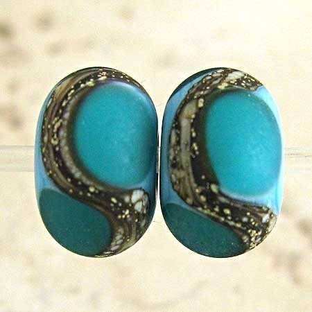 |
| {The sinuous lines on these teal on turquoise lampwork beads by SpawnOfFlame reminde me of the way that she is posing.} |
 |
| {The curly tendrils on the chair remind me of these handmade hook clasps from Rebecca Anderson of TheCuriousBeadShop.} |
 |
| {The swirls and dots bring to mind the curve of the subject and the shape of the leafy vine in this bead by our sponsor EmaKDesigns.} |
 |
| {This Teal Branches lentil by our sponsor Humblebeads is the perfect shade of Olga's dress and the shape of the trumpet shaped flowers.} |
What will you be inspired by in this month's painting? The color? The shapes? The subject? Do tell!

Tuesday, May 14, 2013
Color Cord Mixes and a Free Bracelet Project
.jpg)
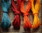
Color Cord Mixes from the Jewelry Accord Shop
Need a jumping off point for your next jewelry design? Try a color cord mix from the Jewelry Accord Shop on Etsy. Lori Eurto does a fantastic job of creating pretty bundles of inspiration with her colorful Irish waxed linen cord palettes. I love the alluring combinations she puts together and I enjoy the fun names she dons them, too!

Are you looking for a place to start on a jewelry design to enter into our Art Bead Scene Monthly Challenges? Lori has been creating color cord combinations inspired by the art piece chosen by the Art Bead Scene team. Look to the Jewelry Accord shop each month to be inspired and pick up a few cord bundles to get creating. You can also request a custom color cord mix to be made in any palette you choose. She may even name a new color mix in her shop after you!

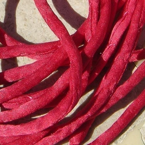
My friend Lori and I share a passion for Irish waxed linen cord. It's one of our favorite materials to work with. She invited me to design a special jewelry project and tutorial to post on her blog highlighting our beloved waxed linen cording. I'm thrilled to share the project here. I created a simple bracelet. The materials may be humble, but the design is one I would wear on a daily basis. Those are the kind of pieces I love to make the most. The everyday jewelry. I love the texture and look of the knotted multiple gemstone strands, the joyful colors of the waxed linen cord and the gorgeous, hand-crafted copper button by Barbara Bechtel of Second Surf Studio on Etsy. The techniques are easy. These simple, tried and true knotting techniques I use over and over in my jewelry. This basic bracelet project is a great example of how easy it is to incorporate Lori's color cord mixes featured in her Jewelry Accord Shop in a jewelry design!

Fortuneteller’s Bracelet
.jpg)
.jpg)
.jpg)
.jpg)

Fortuneteller’s Bracelet
Erin Siegel
Sodalite is said to be the
stone of “insight”. The bright, colorful threads of waxed linen cord remind me
of a long, flowing gypsy skirt that a fortuneteller might wear.
Materials
72 Sodalite 6mm rounds
1 copper 20mm artisan button
by Second Surf Studio
4’feet EACH of 4ply Irish
waxed linen cord in the following colors: Plum, Fuchsia, Red and Sage
Tools
Scissors
Ruler
Finished size: 7 ½”
.jpg)
1: Hold the four pieces of
linen cord together at their centers. Tightly twist the centers of the 4 cords
together for 2”. Fold the cords in half and form an overhand knot, leaving a ¾”
loop of twisted cord.
.jpg)
2: Separate 2 cords. Use 1
cord to string 1 Sodalite round. Use both cords to form an overhand knot after
the bead. Repeat 17 times. Repeat entire step for remaining cords.
.jpg)
3: Use all 8 cords to form an
overhand knot. Separate cords in half and form 3 square knots.
.jpg)
4: Use 4 cords to string one
buttonhole. Repeat for the other buttonhole. Form a square knot on top of the
button. Trim cords to ¼”.
Resources:
Sodalite rounds: FireMountain Gems. Waxed linen cord: Jewelry Accord on Etsy. Copper button: Second SurfStudio on Etsy.
Erin Siegel is a jewelry designer, beading instructor and co-author of
the jewelry book, Bohemian-Inspired Jewelry: 50 Designs Using Leather,
Ribbon and Cords. To find out more, visit her blog: Erin Siegel Jewelry.
Subscribe to:
Posts (Atom)