Pulling Colours
One of the ways I get inspiration for my jewelry, is the focals I use. Just grabbing my favorite focals will sometimes speak to me and bring inspiration as I lay them out. There are hidden colours and undertones that you may not see at first until you see them in a different light or by some accent beads that you have laying around from another project. I have piles of leftover beads everywhere! They do have a purpose however.
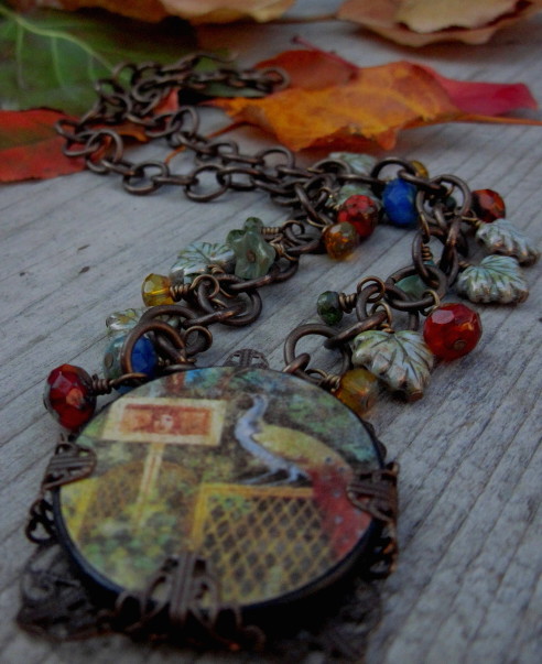
This is the best example I could find of really pulling colours! This Fresco Painting is truly stunning! It has the warm colours like the red of the feathers and the yellow/gold of the fence. It has the cool colours like the blue of the bird's chest and it has the undertones of green and brown that every artist uses. You can see where I pulled the colours and added a mix of shades of each colour, pulling the different tones from the focal. Using a mix of different beads also added texture and interest to the finished necklace.

This particular piece is more subtle than the last. The pendant has very simple shades of what seems to be grey and brown behind the Eiffel Tower. Certainly you could make a very simple piece using some black chain or some wood beads, but to really make the focal shine, put it in your tray of beads, see what hidden colours pop out at you, perhaps some unexpected combinations will shine! I found that this piece really pulled me toward using Vintaj brass with it's earthy rich brown patinas. You can see that adding the filigree really pulls out the brown in the lower half of the pendant.

The Vintage Style key by Tim Holtz was a nice contrast to the deep browns of the filigree and fleur de Lis. It pulls some of the more subtle Grey/browns of the Eiffel tower. The top of the pendant has very cool blues hidden in it's grey sky. I noticed that the crystal in certain positions, mimicked the sky, but when it sparkled, it sent out an array of other beautiful blues, green and teals! So the crystal was added and was the inspiration for the recycled silk sari wraps at the top of the key. The combination makes for a very unique colourful piece that could have turned out very differently depending on the colours you might have seen.

Last but not least I wanted to show a variation of the second necklace, with completely different colours. You can see that once again the Artbead Focal had an array of beautiful colours.The warmth of the brass was perfect for the warmth of the corals and peaches of the pendant. This piece is warm where the last one was cool. But looking at the colours in your chosen focal will bring to life any piece.
You might have seen different colours than I did, you might have seen the Gun Metal grey of the Eiffel Tower, or the soft browns at the base of the pendant. Your version of the necklace would have been completely different. Just imagine the possibilities, when you pull colours!!


6 comments:
Just a quick note to let you know that a link to this post will be placed on CraftCrave today [30 Nov 02:00am GMT]. Thanks, Maria
Fantastic jewels!
Great observations, Marie! Love this post.
Great blog post, Marie! It is amazing what you see when you lay those colors out!
great article :) Thank you!
Wonderful designs here.
Post a Comment